HORME
Client
Horme
Services
Web Design
Branding
Development
Industry
Retail
Year
2026
Credits
Horme
Infos
Designing and implementing a premium Shopify storefront for a contemporary fashion brand, combining editorial inspired visuals with a seamless, conversion focused shopping experience from first impression to the checkout.
Context
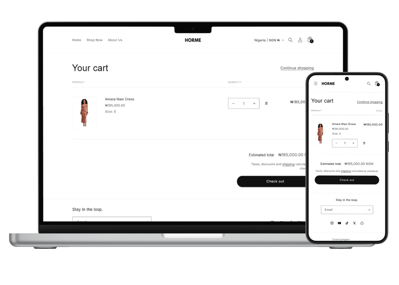
HORME is a conceptual fashion brand that I designed and developed to explore how premium visual identity and e-commerce usability can work together. Rather than treating the website as a catalogue of products, I wanted to create an experience that reflects the brand while helping customers move confidently from discovery to purchase. To better understand the problem, I reviewed a range of contemporary fashion brands and Shopify stores to see how they balanced storytelling with commerce. While many stores looked visually impressive, I noticed recurring patterns that affected the shopping experience. Some pushed creative layouts so far that finding products became unnecessarily difficult, while others relied heavily on standard Shopify templates that functioned well but lacked personality. I also found homepages crowded with promotional banners, competing calls to action, and inconsistent visual hierarchy, making it harder for customers to focus on the products themselves. These observations shaped the direction of HORME. Inspired by the Greek word *hormē*, meaning momentum or the force that drives action, I wanted the experience to communicate confidence, movement, and simplicity from the very first interaction. My goal was to create a premium shopping experience that felt memorable without sacrificing usability. Every design decision was guided by a few clear objectives. I wanted to establish a strong first impression, reduce friction throughout the shopping journey, maintain a clean visual language, and ensure the interface supported the products instead of competing with them. The homepage introduces the brand with a full-screen editorial image and a single primary call to action. Rather than presenting multiple promotions immediately, the layout allows visitors to absorb the brand before encouraging them to explore the collections. Typography, navigation, and the monochromatic colour palette remain intentionally restrained, allowing the clothing to become the primary visual focus. As users move through the website, consistent spacing, clear hierarchy, and familiar interaction patterns help make browsing feel effortless. Collection pages prioritise product discovery through organised layouts, while product pages focus on the information customers need most, including large product imagery, sizing, shipping details, and clear purchase actions. The overall experience aims to reduce unnecessary cognitive load so visitors can focus on making purchase decisions with confidence. Unlike many conceptual projects, I also built HORME in Shopify. Designing within a real e-commerce platform helped me understand how product variants, collection structures, responsive behaviour, theme architecture, and platform limitations influence design decisions. Instead of designing without constraints, I considered how each interface would function in a production environment while maintaining both usability and performance. This project reinforced an important lesson for me. Successful e-commerce design is rarely about adding more features or visual effects. It is about reducing friction, strengthening trust, and helping customers move naturally from discovery to checkout. Building HORME deepened my understanding of how brand identity, user experience, and business goals work together to create an online shopping experience that feels both premium and practical. Note: The password for the Shopify store is "zion".